Freelance Year - March 2024
- Conor Currie
- Jun 16, 2024
- 3 min read
Updated: Jun 17, 2024
Brawl Apart
I spent the majority of this month on client work inside of Unreal Engine.
Upon hopping on the project within Unreal Engine, having discussed with the client beforehand, I decided to condense the current UI. This was due to there being six pieces of information to display; the player portrait, the score, the health, the stamina, the player’s melee weapon and their projectile.
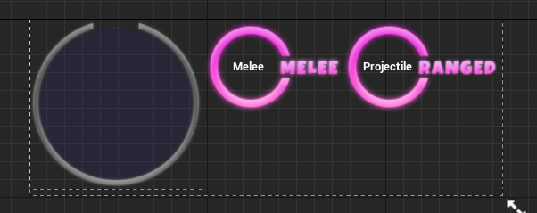
First of all, I decided to merge the score with the player’s portrait, that was using a render target. This was by using the score progress bar as the render target’s frame, while fitting the neon style by lighting up with a neon glow the higher the player’s score is.
Next, I moved the health and stamina as widgets above the player’s head, which was done by putting it into a seperate widget, and displaying it above the player.
To ensure the widget would not rotate with the player and render it unviewable, I then had it remain consistently on the same world rotation through an event tick, with the information for it being recieved through a get widget.
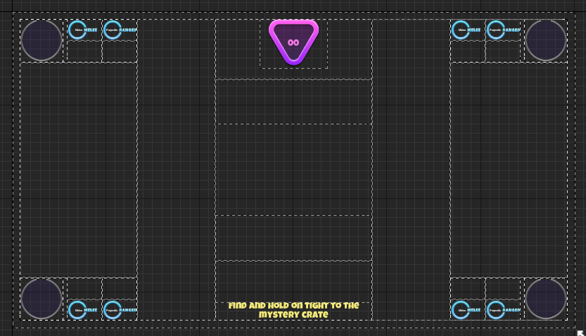
Finally, I have the Melee and Ranged have assets that would now sit beside the icon, with them having more space to be visible from the reallocation of these assets. Additionally, I added a cusfom font, and changed the HUD to give it a more unique style, a before and after being shown below.
On 10/3, I added the assets needed for the main menu, as well as adding buttons for the player’s accessory, emote and colour. A before and after of the main menu can be seen below.
This was my first time working with Horizontal and Vertical Boxes, as I always found them confusing and finicky to try and display assets within. I found this experience the same at first, but found the assets would display unstretched upon designating their alignment in the middle.
I also added buttons in the below grid to preemptively prepare for the character select when it would be set up. Additionally, I used font materials for the first time in replicating the gradient font from Figma, allowing me to save time and make the game more translation friendly by not having to import image assets from Figma, as seen here.
In the following week, after much feedback, I was ready to bring over the Objective Screen into the game. The implementation was simple, due to reusing the text boxes of the original Objective Screen, a before and after being seen below.
Additionally, I found the interface confusing due to how the border around the player image would fill up with a pink glow as a progress bar, while the melee and ranged icon frames have the exact same colour of frame but aren't progress bars. To avoid confusion, I then changed the colour of these assets to blue.
I also looked into figuring out a cursor system. The plan was to have each player have their own unique cursor, with an icon for each. In setting up Player 1's cursor, I found out that I had to change this in game settings, and create a new widget to represent this cursor.
However, upon researching, I found that Unreal didn't support more than one cursor, and the gamepad controls I was binding to the cursor would all be controlling the one instead. This led me to explore and research alternative methods as to how a player could navigate the HUD.
The following week, I was requested to create icons for the game. I was sent reference images of the icons I had to recreate, and got to work.
I settled with a simple one-colour style for the icons so that I was able to create them easily and that they matched the game's style.
I also made some small HUD changes to the game, such as a timer border.
Additionally, I added a new textbox for the "game start timer" into the game, as well as giving it the font material.
Battle of the Bands
While minimal, I worked a small part on this game's style this month. This began with determining the model type. In wanting to create a simple artstyle that is easily achievable for me, someone who lacks deep modelling experience, I decided to settle on a chibi-artstyle, inspired by Pokemon Shining Pearl & Brilliant Diamond.
Then, using Neindroid's as a proportional inspiration, I created an early sketch of how this body would look.
Adding further refinements to character proportions, I then created an early model sheet of the character base, which will allow me to test animations and sizings in-game without needing to create a high-quality model.


Comments