Major Project - Misc.
- Conor Currie
- May 7, 2025
- 8 min read

LEVEL SELECT
As I evolved the style of my project quite rapidly, the level select screen came across further changes. This came both from technical and stylistic issues that I found in the project.

From the prototyping phase, I had planned on having this be part of a 3D interface, having a band van driving from one location to another. On hover, the idea was to have the van drive to that place in quickfire, providing a rather humorous animation. However, I found that the World Map tutorial I aimed to use for a world map wanted instead to rely on arrow keys.
This began to raise a bit of a red flag to me, as I aimed to focus exclusively on having an interface you only need a mouse for, but decided to follow it anyway and see as if there was anything I could borrow from it in regards to a mouse-only interface.
I then remade the interface, with the idea of it being a pop-up upon having reached the desired location. I first began with a low-fidelity remake of said interface.

Then, I gave it a mid-fidelity makeover - though I struggled to incorporate the additional text at this stage, but still wanted a design to demonstrate.

Upon bringing to high fidelity, I decided to give it a little more flair, adding an additional bar at the top of the screen.

Then came the coding. The tutorial I was using included the use of splines, which seemed simple enough. From here, I set up a spline between two locations.

Then, in the code of the travelling player, I had the players ability to move outside of the spline's path restricted, and hid the level window. From there, the level pads the player would step on would set new text for the level window, as well as the level ID, allowing for different levels to be selected.


I did find, upon inital testing, that all seemed to be functionally well.

However, upon further testing, I found the player was not sticking to the spline's path, going free and being able to be controlled in any direction.

I consulted my programmer friends beyond this, to which they attempted to make modifications to the code. However, this ended up short unfortunately. As I tested this, I recognised that even if this was to work, to make this interface stylistically flow with everything else would be an ordeal, due to lack of 3D Modelling experience. Thus, I decided to then scrap this concept, and make the menu exclusively 2D.
From here, I went and iterated upon the menu I had before, this time making an effort to include what I originally had set out to on the low fidelity.

I then decided to have the achievement text behind the icons instead of always displaying, in order to not obstruct the interface - as well as changing the display of the tick icons to resemble rest keys in music.

Having then made level icons through the combination of album covers and discs, I assembled this menu in Unreal Engine.

Additionally, I had a score menu appear from the side from a seperate canvas, similar to the main menu - allowing me to quickly and efficently have said essential menu without significant development.
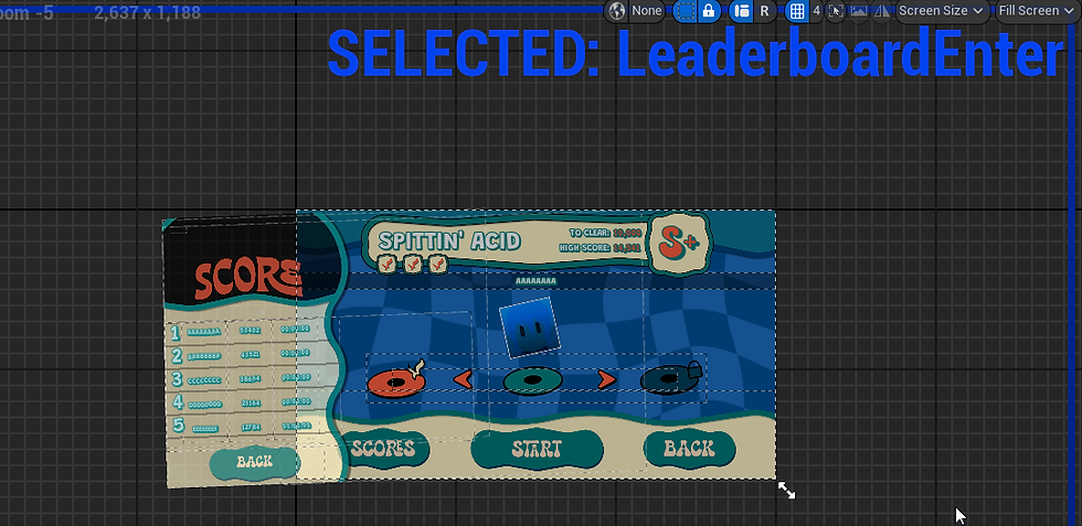
With that, I then added animations - such as the album cover bopping, as well as the menu background, which flowed well. I also added a pop-up description when hovering over the achievement icons, which overall proved far more functionally sound and stylistically dynamic for this menu, even if it took another iteration to get there.

CHARACTER SWITCH
Originally, in the code of the original project, I had the character switch tied to button inputs. This was in order to make the process as simple as possible.
However, in wanting to establish different user interface types for this project, as well as have a more accessible key in order for a more streamlined UX for this project, I decided to have the character select be through an interface, instead, with the concept being that while holding down the Q key, this menu appears - disappearing when the key is released - so that the character can be swapped to in the heat of gameplay.

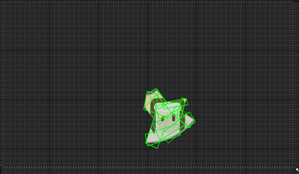
To this, I decided to branch out with a unique interface, though still applying the style guide's colours in the design of the discs where possible, and have the character select wheel take place as a broken disc, with each piece representing a different party member.

Then, in Photoshop, I brought each of the different pieces together.

And, from here, I added a character image to mask on each layer, so they would fit within the bounds.

With the above layer being the hovered state, I then decided to make the regular state an overlay, instead - allowing for greater contrast and emphasis as to which character the player is hovering upon.

Finally, came the task of bringing these interfaces to Unreal Engine. Initally, I struggled - as upon recognising the unique shape, I remembered that Unreal Buttons are always square - and wouldn't have Collision correctly around the desired shape.
To circumvent this, I learned a trick; first and foremost, I made the different options all separate interfaces.

Then, within them, I made a size box, which I placed the button within. From there, I made it non-hit testable as the visibility, allowing the button itself to not be what is triggered for the collision.

Finally, I added multiple transparent images within the canvas panel, which were all set to match the areas of effect for the button.

I then did the same with each other interface, ensuring to stay as inside of the button as I could.


Finally, on each, it would cast to the player, which would change the character ID and the visibility of the player who is meant to be on the map to appear, all the while hiding the previous character.

And thus, it took shape as the following, with the collision wrapped to each buttons image.
GAME OVER
For the game over screen, I struggled and, unfortunately, was not able to find a permanent solution to fix the issue with it - though achieving what I still set out to do with it.

In concepting it, I was inspired by the interface of Super Mario 64, where Bowser’s face shows up as a vignette through the whole screen, as it fades to darkness.

To this, I then made an asset in Figma, resembling the player character’s face - with a comical X-eyed expression. The original concept was to have the transparency exist within the player characters face area, with the white and the black on the outside being what remains.

Then, to establish the different mask layers, I brought this over to Illustrator, spreading this out into different layers through its select tool - to which I got the following five layers.

I then brought this over to After Effects, to which I then had each layer zoom out. The reason I layered them as so is so that there could be two variations, the traditional layer with the mask, which would be the base video, and the mask layer - which would demonstrate the colours that are needed, leaving everything white but the part that was to be cut out.

I originally exported both as MP4, but upon loading the video, I found the material was quite laggy - as well as that, it had quite a low quality. Nevertheless, I tried to Chroma Key the video material, through establishing an alpha, referencing the alpha colour - and setting both the texture and opacity mask.

This, however, was wholly ineffective in a User Interface widget under an Opacity Mask, resulting in this.

With this, I decided to try something different.

I was then advised to instead make this a PNG sequence, which is exporting the video into different individual frames. I then added them to Unreal Engine, putting them in its unique folder, and loading the first frame from there. However, upon making the two together, the layer with the mask colour left upon showed.

It was here when I recognised that in order to obtain transparency, the mask alone wouldn’t remove the colour - and that in order to obtain transparency, I would have to stick to black and white. From here, I decided that I would get rid of the white outline in order to have the mask play as smoothly as possible.

This allowed for the transparency to properly exist, but in exchange to lose the white outline of the original vision, with it instead cutting out all the black on the mask, while not preserving the white outline. Since this had already given me a significant amount of trouble at this point, I was happy to settle for it.

However, one issue I was not able to fix was the choppiness of the cutscene. I tried a few different solutions, such as changing the innate FPS. While changing it to 30 FPS did make it smoother, it was still choppy. In the period leading up to my graduate show, I intend to figure out a way to fix this.
VICTORY SCREEN
The victory screen went through a few design iterations in low-mid fidelity.


Having felt the layout of a more uniform interface would be simpler to interpret and more readable in terms of functionality, I decided to iterate upon the first interface.

Eventually, in feeling more in lieu with other interfaces, such as the main menu and pause menu, which have important information anchored on the top over the side, I settled on the below design.

In coding its function, I first tied the achievements, scoring and grade requirements to the level ID, that which is set in the level blueprint. This would tell what the player had to achieve in order to tell if the player met the requirements to complete the level.

I began with setting the achievements. I first set the amount that was needed for each level in each respective achievement - being that the player needed to have a maximum combo of 30 or more, defeat 10 enemies, and complete the level under 5 minutes. To get the variable on a level-by-level basis, I had a custom event check the variable associated with that level - and set it as the amount variable.
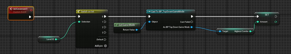
Then, I had the code check to see if this amount was above that, through casting to the player, game mode and timer widget. I also set up a function that sets the amount of times this has been done, and adds it one-by-one to the score associated with that achievement, so it appears on a variable-by-variable basis on the widget itself for dramatic effect - all until the amount variable reaches zero. It also knows wherever to play a tick or X dependant on whether the conditions of the achievement are met.

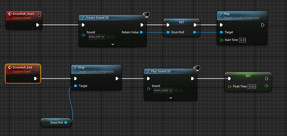
Additionally, code is used to play a repeating drum roll until each variable's countdown is complete.
For the score itself - as well as the combo and time, it instead displays random variables instead of counting down, keeping the player in suspense to their score. This is done the same as before, except setting the amount as a preset variable, in this case 60, and only displaying the score after that.

Additionally, it is able to know wherever to play a "new best score" animation by comparing the current existing one within the Game Instance.

And, in doing so, will write a new one itself.

Finally, upon checking the players score in comparison to the grades set in the ones within the level blueprint, it will display a different animation.


Comments